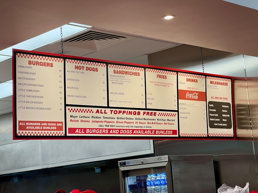
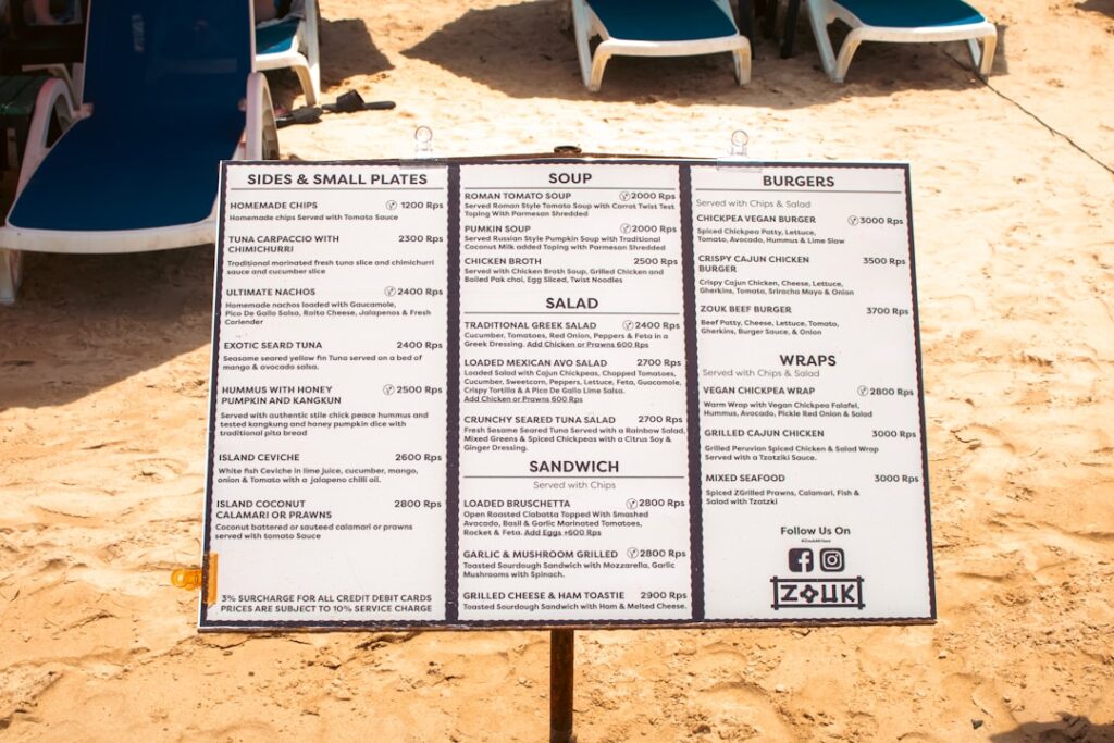
In the ever-evolving landscape of web design, the importance of user experience cannot be overstated. As I navigate through various websites, I often find myself drawn to those that offer intuitive navigation. One of the standout features that enhance usability is the mega menu.
Unlike traditional dropdown menus, mega menus provide a more expansive and organized way to display a website’s navigation options. They allow for a broader range of links and content to be presented in a visually appealing manner, making it easier for users to find what they are looking for. The concept of mega menus has gained traction in recent years, particularly among e-commerce sites and large content platforms.
As I explore these sites, I appreciate how mega menus can accommodate a wealth of information without overwhelming the user. By grouping related items together and offering a clear hierarchy, mega menus not only improve navigation but also enhance the overall aesthetic of a website. In this article, I will delve into the various aspects of creating a custom mega menu, from understanding its benefits to coding and styling it effectively.
Key Takeaways
- Mega menus are large, multi-column menus that typically drop down or fly out from a global navigation bar.
- Custom mega menus can improve user experience by providing easy access to a large amount of content and options.
- Planning and designing a custom mega menu involves considering the site’s information architecture and user needs.
- Coding the HTML structure for the mega menu involves creating nested lists and organizing the content into columns and rows.
- Styling the mega menu with CSS allows for customization of the menu’s appearance, including layout, colors, and typography.
Understanding the Benefits of a Custom Mega Menu
When I consider the advantages of implementing a custom mega menu, several key benefits come to mind. First and foremost, a well-designed mega menu can significantly improve user experience. By providing a clear and organized layout, users can quickly locate the information they need without having to sift through multiple pages or dropdowns.
This streamlined navigation can lead to increased engagement and lower bounce rates, as visitors are more likely to explore further when they can easily find what they are looking for. Another benefit that stands out to me is the opportunity for enhanced branding. A custom mega menu allows me to incorporate unique design elements that reflect my brand’s identity.
From color schemes to typography, every aspect of the mega menu can be tailored to align with my overall website aesthetics. This not only creates a cohesive look but also reinforces brand recognition as users interact with the menu. Additionally, a custom mega menu can be optimized for mobile devices, ensuring that users have a seamless experience regardless of the device they are using.
Planning and Designing Your Custom Mega Menu

As I embark on the journey of creating a custom mega menu, careful planning is essential. The first step involves mapping out the structure of the menu. I take time to analyze the content on my website and categorize it into logical groups.
This process helps me determine which items should be included in the mega menu and how they should be organized. I often sketch out a rough layout to visualize how the different sections will fit together, ensuring that related items are grouped in a way that makes sense to users. Once I have a clear structure in mind, I turn my attention to the design elements of the mega menu.
This is where creativity comes into play. I consider factors such as color schemes, fonts, and icons that align with my brand identity. I also think about how to make the menu visually appealing while maintaining functionality.
For instance, I might use hover effects or animations to draw attention to certain sections without overwhelming users with too much movement. By balancing aesthetics with usability, I aim to create a mega menu that not only looks great but also serves its purpose effectively.
Coding the HTML Structure for the Mega Menu
With my design plan in place, I move on to coding the HTML structure for my mega menu. This step is crucial as it lays the foundation for how the menu will function on my website. I start by creating an unordered list that will serve as the main container for my menu items.
Each top-level item represents a category, and within each category, I nest additional lists for sub-items. This hierarchical structure allows me to create a clear relationship between different sections of the menu. As I code, I pay close attention to accessibility standards.
I ensure that each menu item is properly labeled with descriptive text and that keyboard navigation is supported. This consideration is important not only for users with disabilities but also for enhancing overall usability. By structuring my HTML thoughtfully, I set the stage for a mega menu that is both functional and user-friendly.
Styling the Mega Menu with CSS
Once the HTML structure is in place, I turn my focus to styling the mega menu with CSS. This is where I can truly bring my design vision to life. I start by defining styles for the main container, including dimensions, background colors, and borders.
I also set styles for individual menu items, such as padding and hover effects that will enhance interactivity. As I work on the CSS, I experiment with different layouts to find what works best for my design. For instance, I might use flexbox or grid layouts to create a responsive design that adapts seamlessly across various screen sizes.
Additionally, I pay attention to typography, ensuring that font sizes and styles are consistent with my overall branding. By carefully crafting the CSS styles, I aim to create a visually appealing mega menu that invites users to explore further.
Adding Functionality with JavaScript

With the visual aspects of my mega menu complete, I now turn my attention to adding functionality using JavaScript. This step is essential for creating an interactive experience for users. One of the first things I implement is a toggle feature that allows users to expand or collapse sub-menus when they hover over or click on top-level items.
This functionality enhances usability by providing users with control over their navigation experience. I also consider adding additional features such as animations or transitions when opening and closing sub-menus. These subtle effects can make interactions feel smoother and more engaging.
As I code these functionalities, I test them thoroughly to ensure they work seamlessly across different browsers and devices. By incorporating JavaScript effectively, I enhance the overall user experience of my custom mega menu.
Testing and Troubleshooting Your Custom Mega Menu
After completing the coding and styling of my mega menu, I recognize that thorough testing is crucial before launching it on my website. I begin by checking its functionality across various devices and browsers to ensure compatibility. This step helps me identify any issues that may arise due to differences in rendering or behavior across platforms.
During testing, I pay close attention to user interactions with the mega menu. Are users able to navigate smoothly? Do hover effects work as intended?
If any issues arise, such as broken links or unresponsive elements, I troubleshoot them promptly. This process may involve revisiting my HTML structure or CSS styles to make necessary adjustments. By dedicating time to testing and troubleshooting, I ensure that my custom mega menu provides an optimal experience for all users.
Conclusion and Next Steps
In conclusion, creating a custom mega menu is an enriching process that enhances both user experience and brand identity on my website. From understanding its benefits to planning, coding, styling, and testing, each step plays a vital role in crafting an effective navigation solution. As I reflect on this journey, I’m reminded of how important it is to prioritize usability while also embracing creativity in design.
Looking ahead, my next steps involve continuously monitoring user interactions with the mega menu after its launch. Gathering feedback from users will provide valuable insights into areas for improvement or potential enhancements. Additionally, as web design trends evolve, I remain open to revisiting and updating my mega menu to ensure it stays relevant and effective in meeting user needs.
Ultimately, investing time and effort into creating a custom mega menu pays off by fostering a more engaging and user-friendly online experience.
If you’re interested in enhancing your website’s navigation without relying on plugins, you might find the article “Building a Custom Mega Menu without a Plugin” particularly insightful. For those looking to delve deeper into web development techniques and best practices, you can explore more related content on the Sheryar’s Blog. This blog offers a wealth of information on various topics that can help you refine your skills and create more dynamic and user-friendly websites.
FAQs
What is a Mega Menu?
A mega menu is a type of website navigation menu that typically displays multiple columns of links, images, and other content. It is designed to accommodate a large amount of information and provide a more visually engaging and user-friendly navigation experience.
Why would I want to build a custom mega menu without a plugin?
Building a custom mega menu without a plugin allows for greater flexibility and customization. It gives you complete control over the design and functionality of the mega menu, and can result in a more lightweight and efficient website.
What are the benefits of building a custom mega menu?
Building a custom mega menu allows you to tailor the menu to fit the specific needs and branding of your website. It can also improve site performance by reducing the reliance on third-party plugins and code.
What are the steps to building a custom mega menu without a plugin?
The steps to building a custom mega menu without a plugin typically involve creating a custom HTML and CSS structure for the menu, adding JavaScript functionality for interactivity, and integrating it into the website’s existing navigation system.
What are some best practices for building a custom mega menu?
Best practices for building a custom mega menu include keeping the design clean and intuitive, optimizing for mobile responsiveness, and ensuring accessibility for all users. It’s also important to test the menu across different browsers and devices to ensure a consistent user experience.

